There is one very quick way to find out if your website is visibly mobile friendly (or “responsive” which it also is called) by “grabbing” the bottom right corner of your browser window with the cursor/pointer and make the window really narrow.
If your website rearranges the content so you still can see everything by only having scrolling up/down, then your site probably is good.
If you also have to scroll sideways, your site is not mobile-friendly and most search engines will punish your site by ranking it lower in a search.
Mobile friendly site
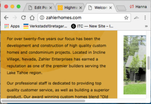
On a regular screen:

On a mobile screen:

Only need to scroll up/down to see all content as it reformats to fit the narrower screen.
Not mobile friendly site
On a regular screen:

On a mobile screen:
Note the scroll bar sideways as well as up/down. That means some of the content will end up outside of the screen on smaller devices and you would need to scroll sideways to see everything.